
Ronnie Cohen writes about the muddle of measurement units he has found on public signs in London, particularly those related to public transport and cycling. If two measurement systems were not bad enough, he has found there are now three.
For public signs in London, we have metres on maps in London Underground and Overground trains, metres on public notices at stations, yards on public signs at stations, metres and yards on private sector signs and advertisements, minutes on signs and maps for pedestrians and cyclists, yards and fractions of a mile for drivers, metric-only private sector restriction signs and imperial-only and dual restriction signs on our roads. Not only do we face inconsistency in the units used, we also face the problem that the distances given in different units are often different, sometimes significantly.
Here are signs that show the inconsistent use of units in different places on public transport in London:
 |
 |
 |
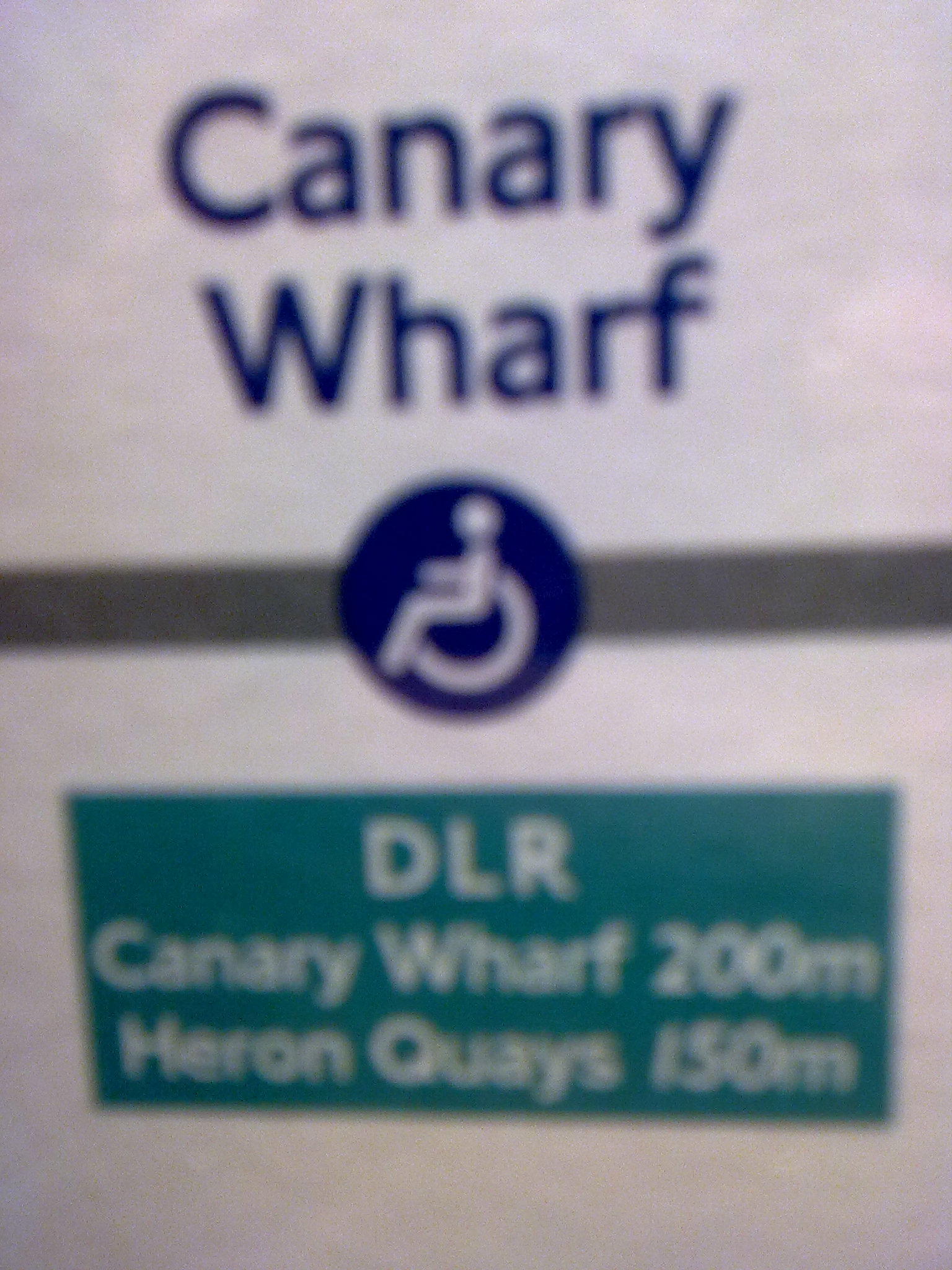 |
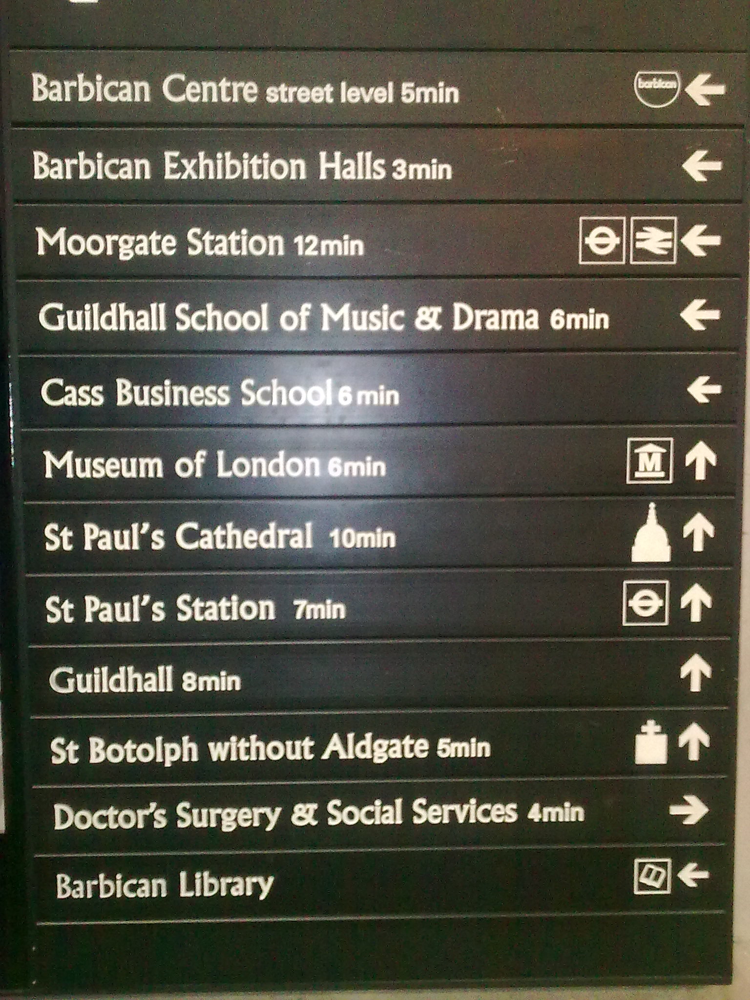
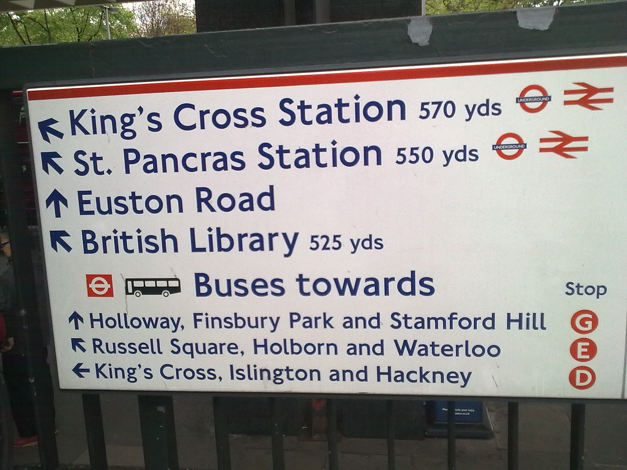
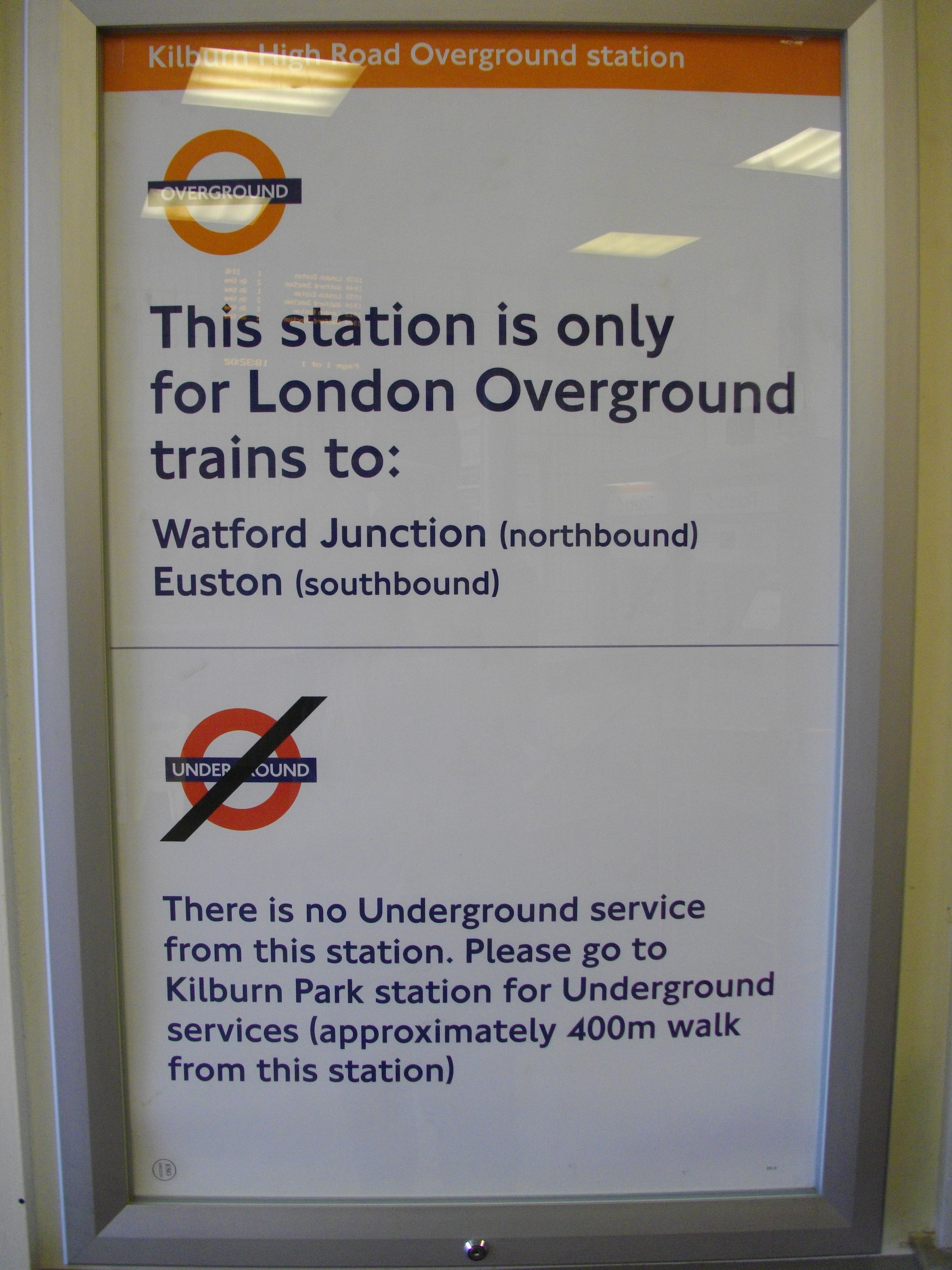
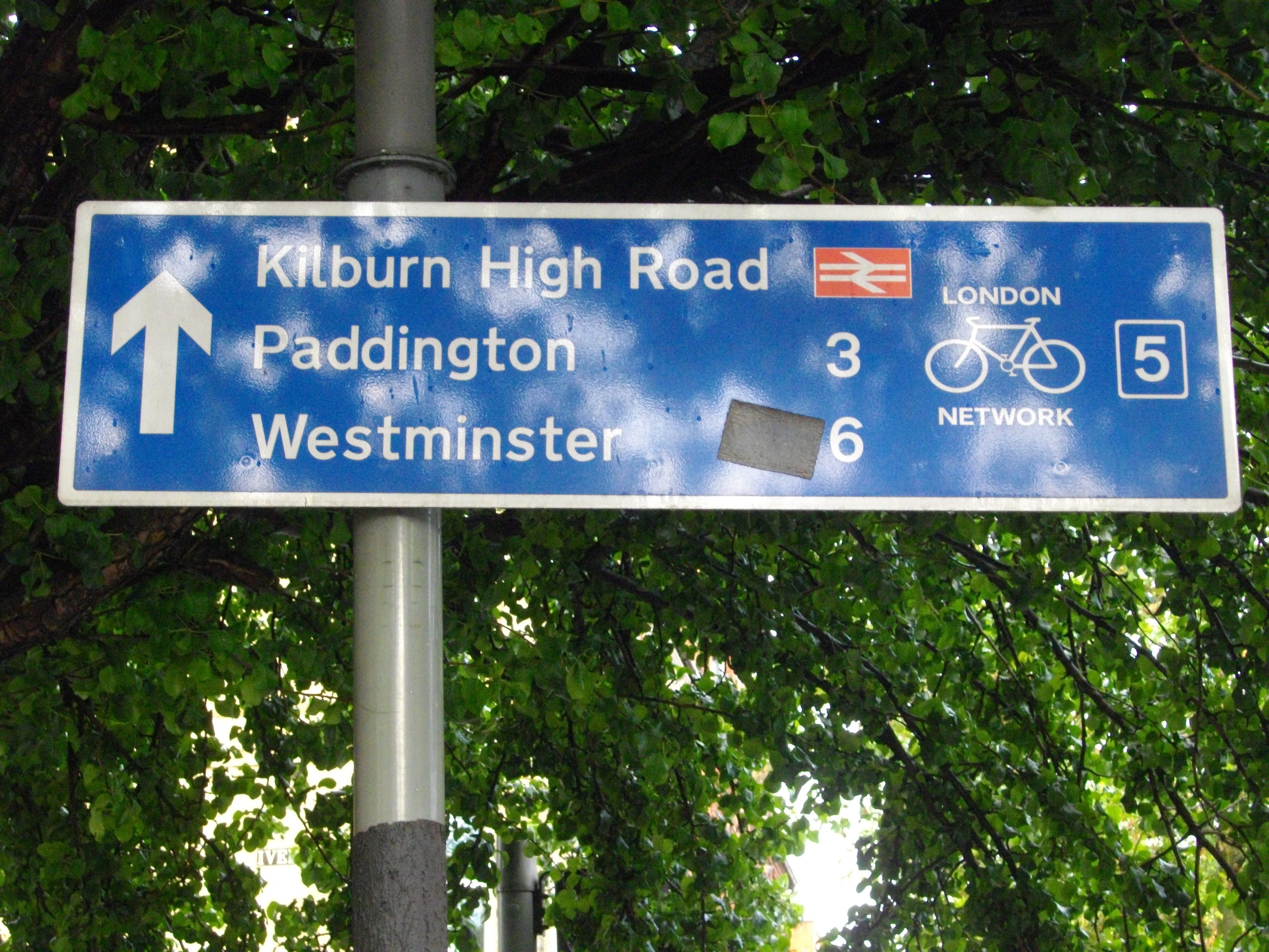
The top-left sign shows the distances to local places at the exit to Barbican tube station in minutes. The top-right sign shows the distances to local places at Euston train station in yards. The bottom-left sign shows the distance to Kilburn Park station on a public notice at Kilburn High Road overground station in metres. The bottom-right sign appears on tube maps on Jubilee Line trains and shows the distances to nearby DLR stations in metres. So we have a mixture of yards, metres and minutes used to express distances on public transport in London. Why are millions of passengers in London denied consistent information about distances on public signs and maps? The use of common units would support consistency whereas the use of different units undermines that. The current situation makes it hard to compare distances. How can we compare distances in minutes with distances expressed in yards and metres?
This confusing muddle even extends to the provision of information to the public. On the Transport for London (TfL) website, the web page about the Tube Upgrade Plan uses a mixture of kilometres and miles to express distances (see http://www.tfl.gov.uk/corporate/projectsandschemes/18072.aspx#qu7). This web page contains a Common Questions section. In part of the answer provided to one of the questions, “When will the work be finished?”, TfL writes, “We’ve replaced over 200 km of track.”. However, in part of the answer provided to another question, “Why don’t other metro systems have these issues?”, TfL writes, “We have 249 miles of track compared to 133 miles in Paris or 56 miles in Singapore.” Now ask yourself, how much of the total tracks have been replaced? You cannot answer this question without doing some mental arithmetic to convert miles to kilometres or kilometres to miles. If TfL had written, “We have 400 km of track compared to 214 km in Paris or 90 km in Singapore”, we would have easily been able to see that half of all the tracks have been replaced, a fact obscured by the inconsistent use of measurement units.
Given that Imperial measures are permitted only for “road traffic signs, distance and speed”, that the use of miles is mainly confined to the UK and USA, and that kilometres are used worldwide, TfL could improve communications with the public, including the millions of foreign residents and tourists who come here from all over the world, by using metric units exclusively in its communications with the public. Metric units also have the added advantage of being clear and unambiguous, hence the use of metric units to define all old and new measurements.
Here are signs that show the inconsistent distances as well as inconsistent units in different places on public transport in London:
 |
 |
 |
 |
 |
 |
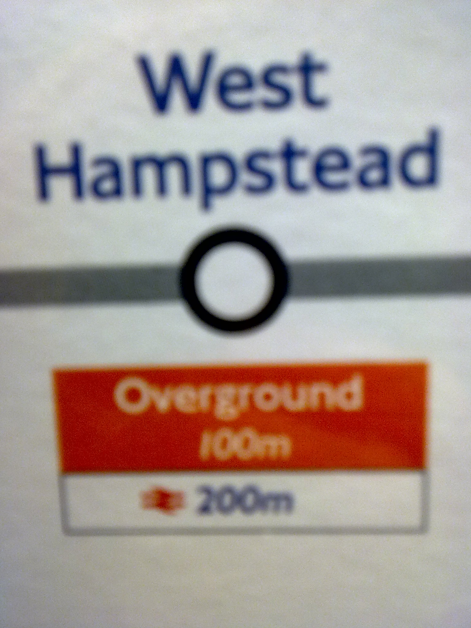
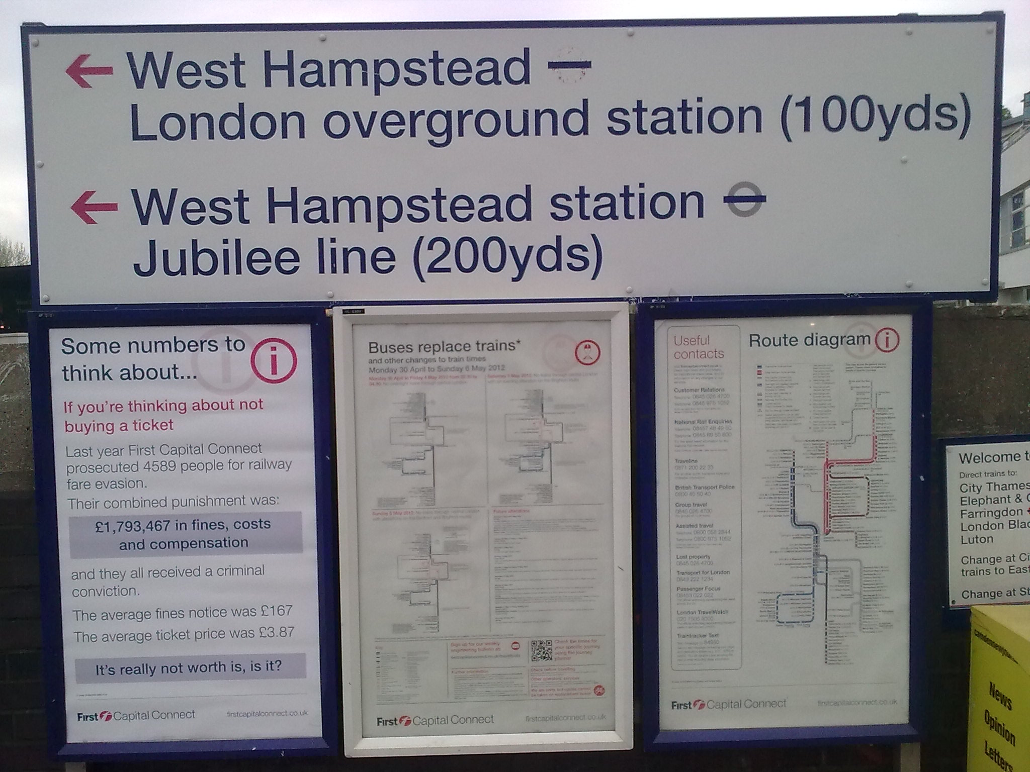
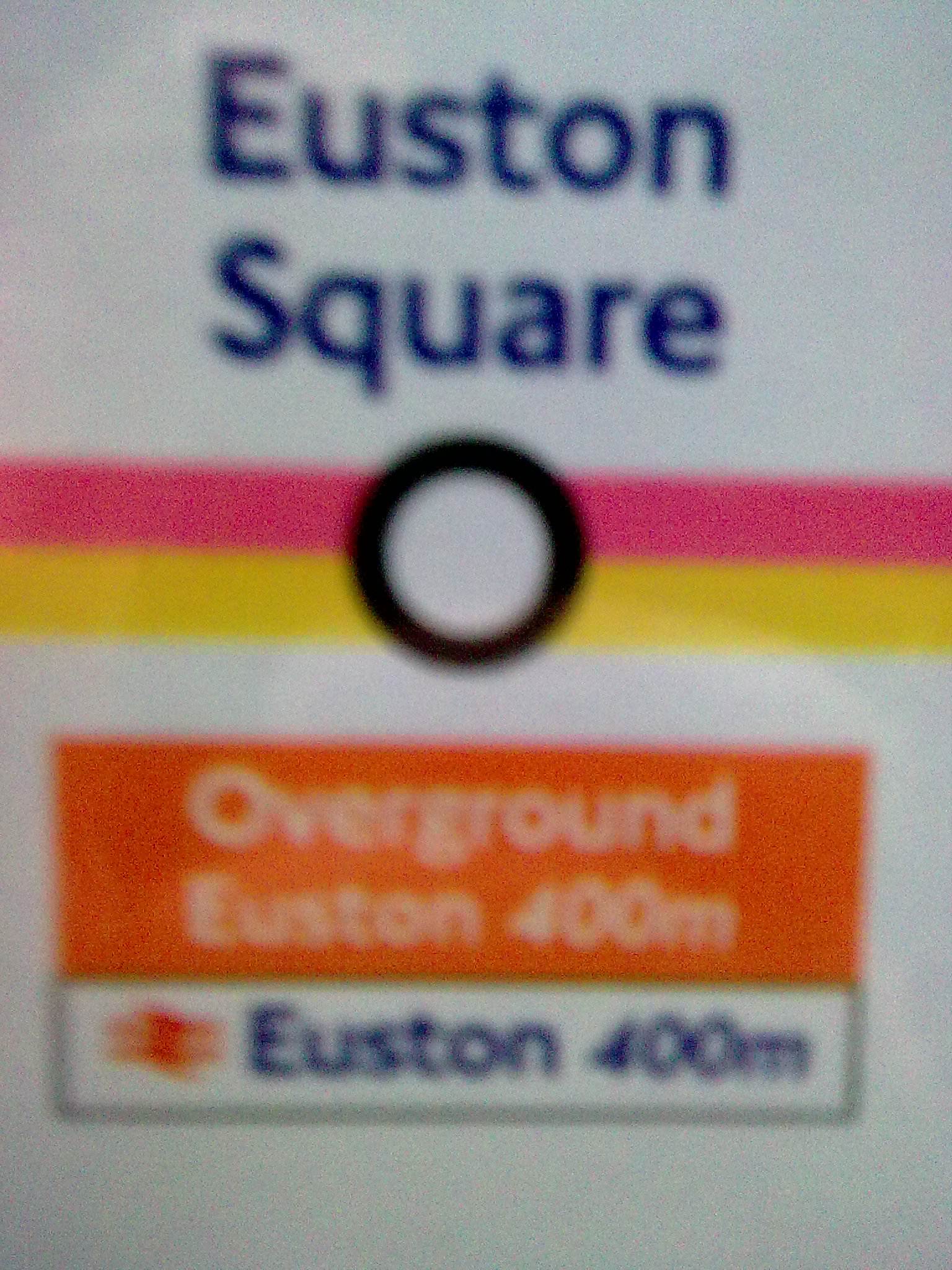
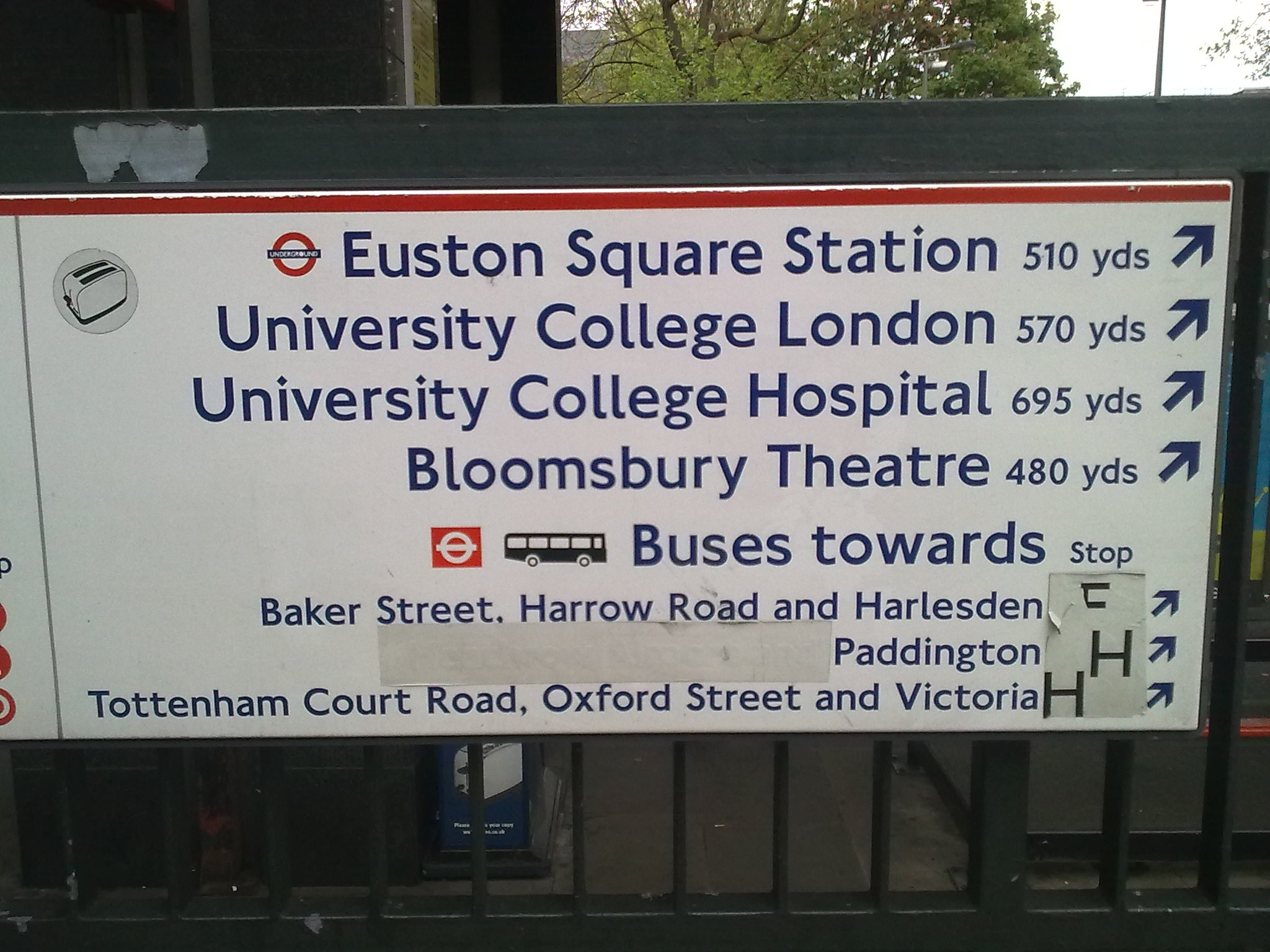
The images in the first column appear on tube maps on underground trains. The images in the second column are public signs that appear at train stations.
The top row of images shows a distance of 200 metres from West Hampstead underground station to West Hampstead Thameslink station. However, when you go to the West Hampstead Thameslink station, the sign shows a distance of 200 yards from there to West Hampstead underground station. So what is the distance between the West Hampstead Thameslink station and West Hampstead underground station? Is it 200 yards or 200 metres? They cannot both be right. One of the figures must be wrong. Which is correct? There seems to be confusion over the difference between yards and metres.
The second row of images shows a distance of 400 metres from Euston Square underground station to Euston train station. However, when you go to Euston train station, the sign shows a distance of 510 yards (466 metres) from there to Euston Square underground station. There is a big difference between these figures. It exposes the folly of using two systems of measurement for showing distances between stations. Despite the information given, we still do not know the correct distance between Euston train station and Euston Square underground station. It is obvious that one of the figures is wrong. Again, we ought to ask, which is correct?
This is a typical example of the lack of consistency in the use of measurement on our roads and on public transport. Not only do we face a lack of consistency in the use of metric and imperial units, we also face a lack of consistency in the distances shown between stations.
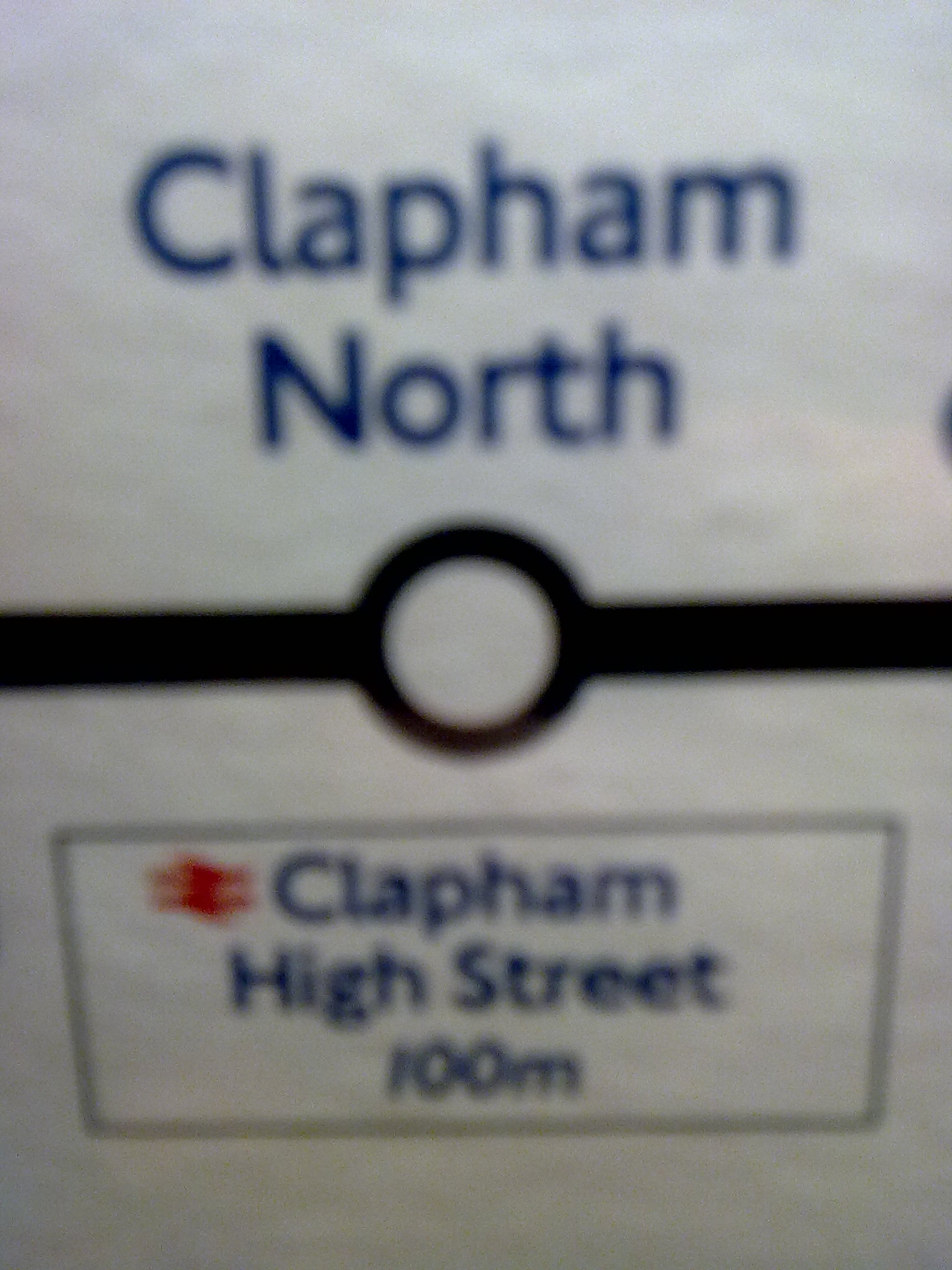
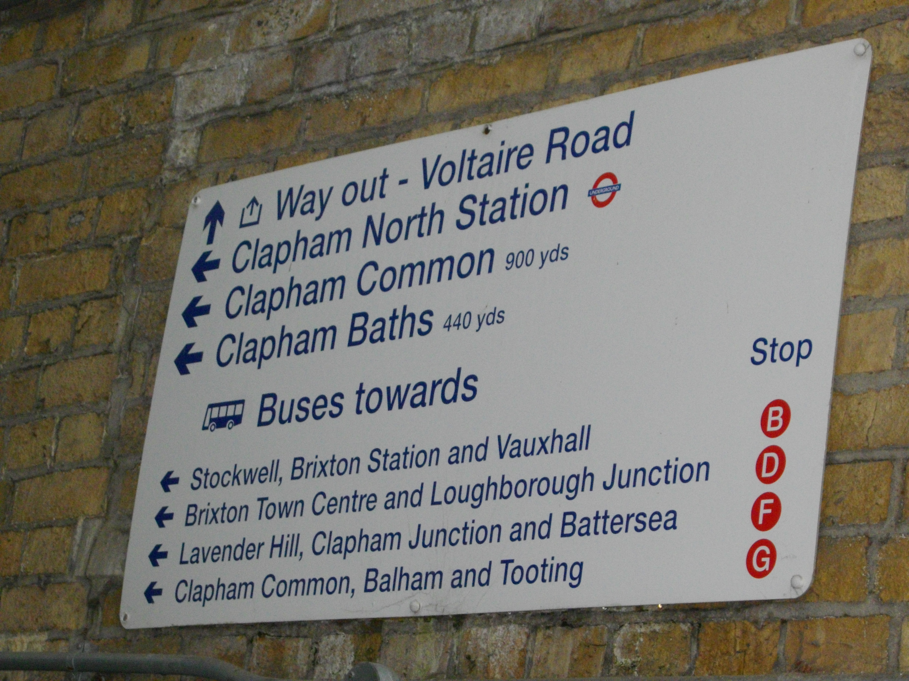
The third row of images shows a distance of 100 metres from Clapham North underground station to Clapham High Street train station. Interestingly, no distance is given to Clapham North underground station from the sign at Clapham High Street train station, despite the fact that this sign gives distances to other locations in the local area. I wonder why.
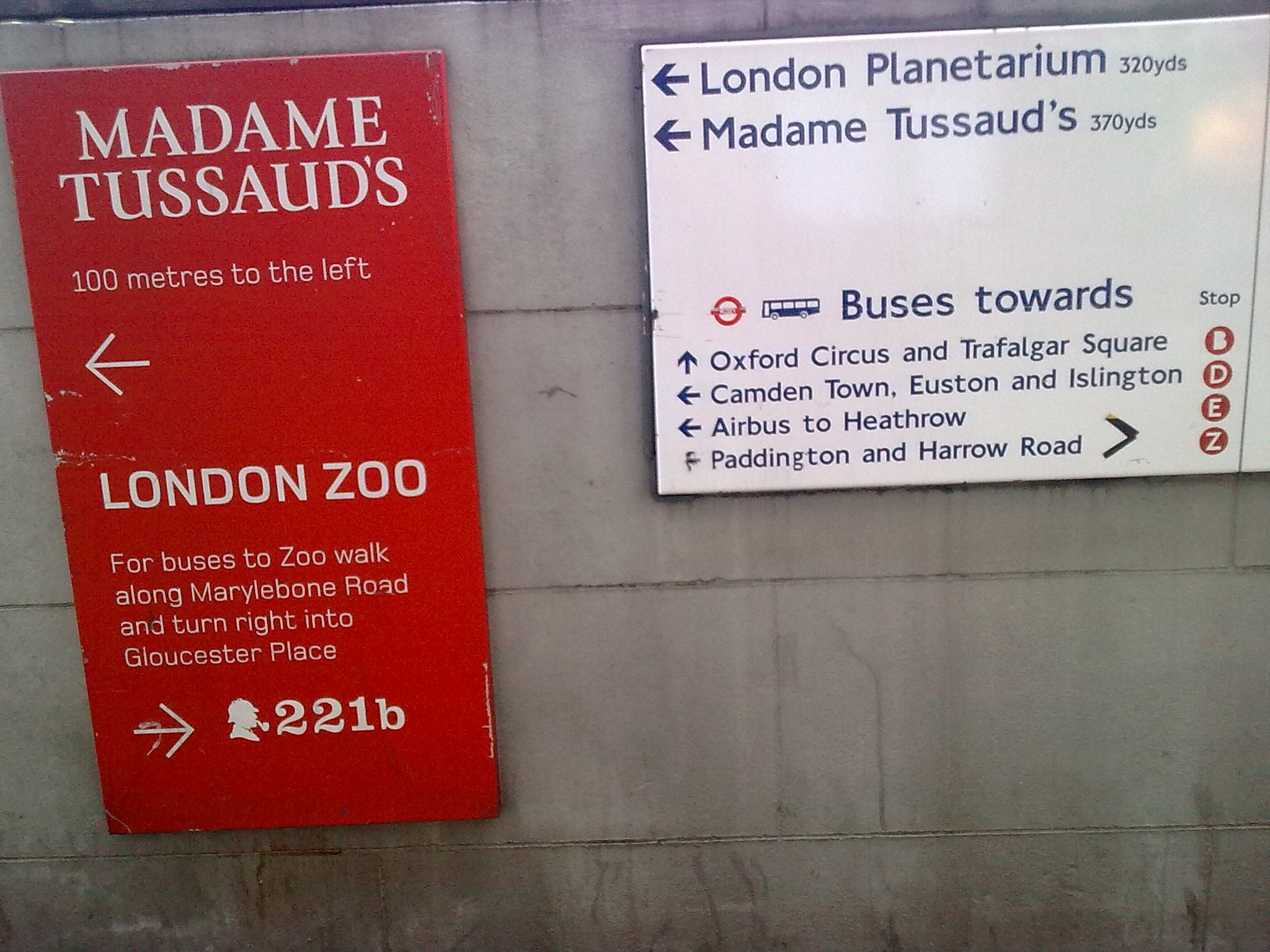
The strangest image shows two signs next to each other outside Baker Street underground station, one showing a distance of 100 metres to Madame Tussauds tourist attraction and the other showing a distance of 370 yards (338 metres) to the same place.
There are other examples of muddled distance measurements in London. For example, maps inside Westfield White City shopping mall use a metric-only scale. Yet the bus station outside the shopping mall contains a public sign with a map that shows distances expressed in minutes.
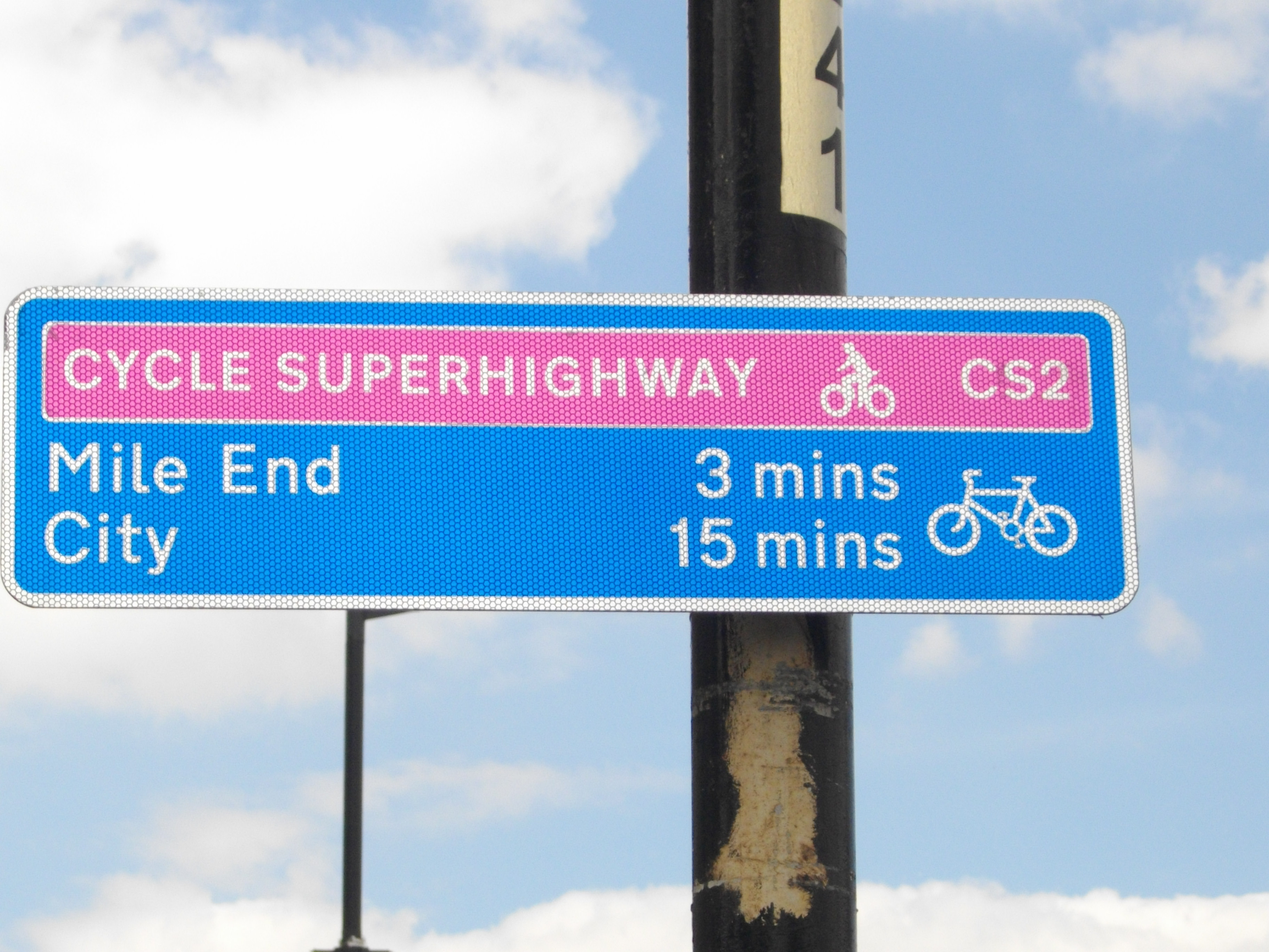
For cyclists, this situation is particularly bad as they have to tolerate signs like the ones shown here:
 |
 |
The image on the left shows the number of minutes to particular locations. I wonder how fast you need to cycle to arrive at these places in the specified number of minutes. The signs give you no clue. It could take more or less time to get there than the number of minutes shown depending on how fast you cycle. The difference could be huge. That is why the display of minutes on cycling signs is daft. The DfT prefer to show cycling times rather than allow metres on distance signs. And of course, such information is of even less value to other road users.
Given the introduction of minutes on cycling signs and the requirement use of miles for distances on UK roads, I wonder whether the cycling sign on the right, which contains no unit names, abbreviations or symbols, shows the number of minutes or the number of miles to the places shown on the sign. This is unclear. Are cycling signs only supposed to show minutes or can they show miles like other UK road signs? And if minutes, why not metres?
The measurement mess is not just confined to road transport. It is bad enough that British drivers have to use imperial signs that are incompatible with driver location signs and emergency marker posts, the Highway Code, the Ordnance Survey and with road signs in all other European countries. This muddle affects all transport signs, including signs for pedestrians. The units used are inconsistent and often confusing and the distances are often contradictory. Where there are significant differences, the public are left puzzled wondering which signs to believe. London’s millions of passengers, pedestrians and road users deserve better than this. It is about time that our leaders woke up to the fact that we only need metres and kilometres to express distances for all forms of transport.

This should be brought to the attention of the Olympic organisers. It is obviously confusing, especially for foreign visitors to London. Their comments might carry more weight than ordinary citizens.
Of course, the only sensible solution would be to ditch the non-metric measurements and simply stick with metric distances.
LikeLike
The posting of “distances” in minutes for pedestrians and cyclists is the craziest idea I’ve ever seen. Surely DfT’s acronym should be revised to DafT. Perhaps all the vehicular distance signs could be revised to minutes at the speed limit. When active signs are available, it could be adjusted to actual road speed. For fear DafT might take this suggestion seriously, I will point out that it is dripping with sarcasm that may not be entirely evident to them.
Walkers and cyclists each exhibit a wide range of speeds depending on individual fitness, and clearly separate times must be indicated for pedestrians and cyclists, making for a more cluttered sign. I suppose we should be grateful DafT did not use the symbol “m” to mean miles, metres, and minutes, so that it would be entirely impossible to determine what the sign was attempting to convey.
The mixing of yards and metres is confusing, but how accurately can one pace off the distance anyway? As an American, I am not used to thinking in yards. Rather than multiplying by three to get feet as on our signs, perhaps I will just accept them as “almost meters.” They are only in error about 9%.
Seriously, with the Ordnance Survey in metres and road (and pathway) signs in yards, no one at DafT is thinking of the user or of a solution made “with whole cloth.” Even if you stick with miles and yards for roads, roadways and pathways are not the same thing; metric could be used for pedestrian signs.
LikeLike
In Switzerland walking signs frequently have the average walking time shown rather than the distance. I wouldn’t campaign to get rid of the minutes, as they are more likely to be replaced with imperial measurements rather than metric ones given the current political climate.
LikeLike
And what exactly is the walking speed of the unknown reference walker. There is at least a 3:1 ratio between those strolling and those walking briskly, so the minutes are basically useless.
I am aware the point of “Metric Views” is, well, metric views; however, the minutes of walking time concept is so bizarre compared to any actual distance that yards or even royal cubits would be superior. Of course, metres would be better still.
Perhaps DfT would like to change the London Marathon to a two hour run and simply see where everyone is at the end of two hours.
LikeLike
It is true that average walking times in woods and forests on the continent are often shown in minutes. This to me is ‘hiker-speak’ where the length of time it takes to get somewhere is more important than the actual distance. If the walk is up hill and down dale, the actual average time it should take to get there is no doubt more important to the hiker than the actual distance covered. But this does not in my view apply in an urban environment like London. The ‘walking time’ along somewhere like Oxford Street will vary enormously depending on whether you are walking along there, for example, on a Saturday afternoon or early on a Sunday morning. In this kind of urban environment it makes more sense in my view to have a sign showning the actual distance (which cyclists and drivers may also be able to catch sight of). Whether you are walking, cycling or driving the distance is going to be the same. But there is no point in erecting even more useless imperial signs so I would ask for such signs to be in metres.
LikeLike
TFL is metric except for speed as far as I am aware (presumably their responsibility for streets is another area due to UK law). The miles/km fudge in the tube upgrade copy is a little strange for an organisation that is usually (I have found) relatively consistent. In regards to the signs in the photos, it’s easy to tell who owns them by the typeface. The first and third are the responsibility of First Capital Connect and Network Rail respectively. The second is clearly a TFL sign, but looking at it and the Madame Tussaud’s one it is pretty obvious that they are at pre 2004, as the Airbus service ended in that year. Also note the large stickers covering up bus stop letter and destination changes. If/when these signs are updated they will definitely be in metres.
Assuming that TFL takes over more rail franchises in London, the muddle on London’s streets could well decrease over the next few years.
I would point out that the Metro newspaper seems to be overwhelmingly metric, and the Evening Standard doesn’t make a bad effort. Considering the state of the national papers, they seem to be doing an okay job.
I would also like add that everyone I know of my generation (currently of university age) uses metres for short distances and miles for long.
LikeLike
I suspect that indicating journey times rather than distance is a form of ‘dumbing down’ to make the signs seem more helpful than they really are or trying to tell people what they want to hear (or read).
It is sad that the British public don’t condemn these practices for the obvious reasons.
LikeLike
If you think about it (and I write this as a Londoner) it is an absolute disgrace that a city that in all other respects thinks of itself as world-class should have such a jumble of units for distance on its signs. Where is the joined-up thinking?
LikeLike
Many maps in London show the “distances” from “You are here” by means of concentric circles marked “5 min”, “10 min” etc. Assuming that they are working on 60 metres per minute, then points that are 300 metres away are shown as being 5 minutes away regardless of whether that 300 metres is along a road or whether it is the diagonal of a building. If one applies Pythagoras’ theorem, it is easy to see that this can increase the distance walked by a factor of 1.41!
LikeLike
Baker street to Madame Tussaurds. I tried to find out which of these two was correct. Going to the MT website it gives “Madame Tussauds is a two minute walk from Baker Street tube station.” So now we have three. Measuring on a large scale A-Z map I get about 250m, thats four. Google maps gives 331 ft, time 16 seconds, it suggests walking instead, 1 min. That is 7 different figures by some significant margin.
I guess my origional guess was right, the TfL (presumably) sign should have read 370 feet perhaps? So now I know (I think). It is 100m (100 miles?). I should do that in, maybe, about 50 seconds, depending on traffic.
Seriously though, we do need to get such simple things right. I wonder how much real damage is done by stupid signposting and sloppy translation of what was once a very precise measurement by a good surveyor.
LikeLike
Dear BrianAC: I think you have made the point. Put up signs with the distances in the measures the surveyor used – metres – then nothing will get ‘lost in translation’.
LikeLike
When you think about it there is really no excuse for using anything other than the metre for distances on public information signs for pedestrians.
There is nothing in law preventing it (contrary to the claims of some) and it is known to everyone both domestic and foreign. The metre has been around long enough in the UK for everyone to know that it is slightly longer than a yard (for those who still think in those units) and it is certainly common currency to everyone else.
If there are any genuine concerns about the ability of pedestrians to understand the information (which I doubt) then perhaps we should be reflecting on the ineffectiveness of our education system. We certainly shouldn’t be trying to compensate for it by degrading the clarity of public signs.
LikeLike
This exchange of e-mails illustrates how the malign influence of the DfT spreads far and wide:
Sent: 26 June 2012
To: Cotswoldway
Subject: Cotswold Way web site
I noticed a slight inconsistency in your web page. The Pennine way gives distances in kilometres first (then miles) while you give the distances with miles first (then kilometres).
I think it would be better if you put the kilometres first. First of all, mistaking kilometres for miles is unlikely to be dangerous, but mistaking miles for kilometres could be fatal for a walker in distress.
Remember that people unfamiliar with the country are more likely to get into trouble, and these are the very people who are more likely to be used to kilometres.
Could you make this change?
Michael Glass
REPLY
From: James Blockley
Date: Tue, 3 Jul 2012 10:46:52 +0100
Subject: Cotswold Way web site
Dear Michael,
Thank you for your message. When we designed the website we did consider how best to relate distances in terms of units. Whilst many international visitors are more familiar with kilometres, we made the decision to use miles as the primary unit across the website as the bulk of our users are from the UK and are more familiar with this. We also wanted web information to relate to the signs on the ground which are in miles to avoid confusion between the two.
Kind regards,
James (National Trail Officer, Cotswold Way).
LikeLike
Really??
I wonder when James Blockley last looking at an Ordnance Survey map, or pretty much any map for that matter. Where has he ever seen a map, other than a car road map in miles? Miles are for cars on roads, walkers do km as do just about everyone else. Interestingly the Ordnance Survey map on the site is, as expected, in metric.
This gives me a lead into a recent BBC South East news article about the National Trust buying part of the Dover cliffs. They are buying a strip of coastal cliffs 1 mile long by 200 metres wide. Not with my donations chappie.
LikeLike
As signs for pedestrians are for the most part installed for the benefit of tourists (How often do you see pedestrian signs away from tourist areas? Very rarely.), the only sensible units of measure to use are metres.
Absolutely everybody from all around the world already knows how long a metre is (even Americans: it’ll be mentioned in their tourist guidebook on the same page explaining that our currency is the pound sterling and that we measure temperature in degrees celsius), and even those grumbling older Britons must surely know by now that a metre is roughly the same as a yard.
But the converse does not really apply for the entirety of the rest of the population of the world (including those of us who of course were never taught anything about yards or other imperial measures at school). “yds” will be an unfamiliar abbreviation to most tourists and therefore hardly helpful (especially if they’ve never encountered yards before, which is very much more likely than the converse (encountering metres) is for an American (or Briton) who has ever ventured abroad before). Until you get to kilometre-plus distances (by which time perhaps hopping on a bus or tube might start to be the better option for some) the difference between metres and yards is sufficiently insignificant that they would be better taking the more globally useful option of labelling the signs in metres and be done with it!
LikeLike
@David
Agreed. As a reminder, the US does not allow the yard as a unit on road signs (feet or miles, inches are OK on clearances), so even Americans won’t have a point of reference (except golfers and (American) football players. The signs in yards ONLY have meaning to the British, NO foreign tourist is served. Probably more Americans would correctly understand the sign in metres than in yards. The dumber, less travelled American might not know a metre and a meter are the same thing, so use the symbol, not the word or some random abbreviation.
LikeLike