Ronnie Cohen looks back at the 1963 Worboys Committee report and reviews how well the current version of the TSRGD addresses the main criticisms of the earlier traffic signs system and the Committee’s findings and recommendations. He suggests ways that current signage can be improved to meet the Worboys ideals.
By the early 1960s, the traffic signs system, introduced in 1933, was seen as inadequate for modern traffic conditions. In response to growing criticism, a Committee was set up in 1961 to review British traffic signs and was chaired by Sir Walter Worboys after whom it was named. The Worboys Committee published their report in 1963. Their recommendations were generally accepted and incorporated into the first edition of the new sign regulations, known as the Traffic Signs Regulations and General Directions or TSRGD for short, which came into force on 1 January 1965.
The Committee investigated traffic signs in great detail, including colour schemes, font types, letter sizes, letter thickness, letter spacing, sign shapes and the use of symbols. They strongly favoured symbols over words, saying that “the use of symbols rather than words made the signs easier to identify from a distance.”. They described the ideal system as a combination of “American shape-colour coding with the European use of symbols” but felt that this would be impractical as “it would not have been consistent with other countries.”. Instead of this ideal, they suggested that the UK should follow “European practice by using largely symbolic signing for warning and regulatory signs without the use of worded plates to explain the symbols”. When choosing a dark background for primary route signs, the Committee recognised the prospect that large signs can be environmentally obtrusive.
The main criticisms of the existing systems were [sic] that:
-
signs were too small to offer an effective target and to be read easily by drivers travelling at normal traffic speeds;
-
the more important signs could not be readily distinguished from the less important ones from a distance;
- they were often not effective at night;
- they relied on a knowledge of English and were not consistent with international signs; and
- they were badly integrated and were generally mounted too high in rural areas.
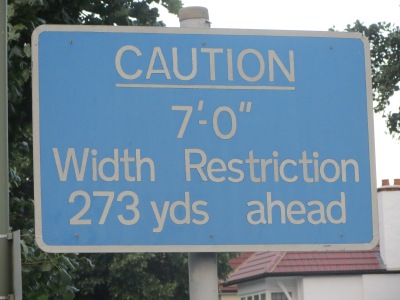
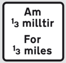
Great credit is due to the Committee for creating a signing system that addressed points 1, 2, 3 and 5. However, the criticism in point 4 is still a valid criticism of current signage. While some words and phrases on signs have no obvious alternative pictograms or symbols, a lot of British traffic signs use unnecessary words. Several examples of the use of unnecessary words with alternative signage is shown on the UKMA gallery page at http://www.ukma.org.uk/gallery. There are countless other unnecessary language-specific signs. Here are some examples:
Alternative pictograms and symbols exist for all the images shown above. The continued use of archaic measurement units on British roads requires the use of words and language-specific abbreviations because there are no accepted language-independent international symbols for miles, yards, feet and inches. The pre-Worboys signs were criticised for relying on a knowledge of English and not being consistent with international signs. As long as archaic measurement units continue to be used on British roads, this will remain a valid criticism of current British traffic signs. One obvious lack of consistency with international signage is the use of non-metric units on British traffic signs. Among all developed countries, only the UK and USA use non-metric units on their roads. The UK remains the only European country that uses non-metric units on its roads.
Where words are not used for imperial measurements, the following abbreviations are used for such measurements:
- “m” is the international symbol for metres but is also used for miles. So “m” on a distance sign for motorway services is used for miles but “m” on a width or height restriction sign means metres.
- “mi” is also used for miles.
- “yd” and “yds” for yards.
- “ft” for feet.
- “in” for inches.
- ‘ for feet. A single quote mark is the international symbol for a minute of arc.
- ” for inches. A double quote mark is the international symbol for a second of arc.
Unlike imperial units, there are accepted international symbols for metric units. These can be used on British traffic signs if metric units were authorised for all traffic signs that involve measurement. Here is a table of language-independent international symbols for metric units that can be used on traffic signs:
| Symbol | Meaning |
|---|---|
| km | kilometres |
| km/h | kilometres per hour |
| m | metres |
| t | tonnes |
| h | hours |
| min | minutes |
In addition to the use of metric symbols, the UP arrow can be used to mean straight ahead. This symbol is widely used for pedestrian signs. It would also seem sensible to use the 24-hour clock for showing times on relevant signs with a colon to separate hours and minutes instead of the use of English abbreviations, “am” and “pm”. The 24-clock is universally used on railway timetables and for scheduled flights. On signs that show times, a case can be made for the use of international symbols for hours and minutes.
One major problem with British traffic signage is that there are too many authorised variants for various sign types. This is especially true for vehicle dimension signs. Other examples include sign variants and the use of unnecessary word-based plates shown under pictograms that add no extra useful information. You can find them in the “Know Your TRAFFIC SIGNS” DfT publication:
While the Worboys Committee report led to a great improvement in British traffic signage, there is still room for improvement for replacing English and Welsh text with language-independent pictograms, signs and symbols. The Committee recognised the clear benefits of making British signs consistent with international signs and the advantages of pictograms, signs and symbols over text.
For an in-depth report about modernising UK traffic signs, see http://www.ukma.org.uk/sites/default/files/MSA.pdf (report update: http://www.ukma.org.uk/sites/default/files/msaupdate.pdf).
For a summary leaflet about modernising UK traffic signs, see http://www.ukma.org.uk/sites/default/files/Traffic_Signs.pdf.


Since there is no international acceptance of Imperial or Customary, I think there is no hope of international agreement on symbols for those units. However, I think the principal users (US and UK) could agree. Such symbols should not conflict with metric symbols, so I would urge the UK to drop “m” and use “mi” for miles. The US also uses all the other symbols you discussed (we do not use yards on road signs, but we use yards, symbol “yd,” in other contexts).
Your signs are very verbose. The verbosity requires a non-English speaker to have a much greater English vocabulary. Simplified wording and greater use of symbols means the non-English speaker only needs to understand a handful of words to obey the traffic laws.
I might disagree on the new roundabout sign. Drivers do get set in their ways, and we temporarily put up signs with the word “New”, symbols or words representing the new element, and the word “ahead.” (We would use a symbol for the roundabout. These had mostly been called traffic circles in the US, but roundabout is becoming more common.)
LikeLike
Unbelievably, the suggestion seems to be that the sign currently used to give the distance to a hazard should, in the future, be used to give the length of a hazard! To radically change the meaning of millions of road signs that have been in existence for decades is never going to be a good idea.
If it is really deemed desirable to start using a new design for “distance to” (the up-arrow is suggested), common sense tells us that the old design needs to be scrapped – and not reused for something else – and a new design invented for “length of”.
LikeLike
Here is another example of why simple signs are better:
http://www.brisbanetimes.com.au/queensland/pictures-to-speak-louder-than-words-on-parking-signs-20151124-gl6c6g.html
Yet another reason to convert road signs to international norms along with metric.
LikeLike
@Charlie P
I suggested that no arrow is used to say that something exists for the next x metres (i.e. the length of a hazard). The length of some hazards are already given as “300 yards”, “1 mile”, etc. without any additional words, abbreviations or symbols.
I suggested the use of the UP ARROW only for a hazard that is x metres ahead (i.e. the distance to a hazard). That is how my suggestions distinguish between the two. The up arrow is widely used on pedestrian signs to show that something is x metres ahead and would already be highly familiar to millions of people. It is also used to provide information about motorway lanes, often with “ANY VEH” added at the top. Hence the UP ARROW has only one meaning in my suggestions and I only use it for x metres/kilometres ahead.
Just because some signs have been in existence for decades does not mean that they cannot be improved.
LikeLike
@Ronnie Cohen
Yes, my point exactly. Changing the use of the distance plates with no arrows, as you suggested, from indicating the distance to a hazard to indicating the length of a hazard is a recipe for confusion, even danger. Please reconsider.
LikeLike
@Charlie P
The current meaning of arrows does not need to change. I have probably misunderstood that LEFT, RIGHT and UP arrows mean the length of a hazard rather than the distance to a hazard. I have made several suggestions to explain how the use of words on road signs can be reduced.
The main points I have made remains valid. They are that signs, symbols and pictograms should be used instead of words wherever possible. They will make road signs clearer, simpler, easier, smaller, and easier to read. The latter is critical when drivers travelling at very high speeds have very few seconds to take in all the information from all the road signs presented to them. Examples of such signs can be at found at http://www.ukma.org.uk/gallery.
LikeLike
Good article with really good suggestions.
But surely “For 1/3 mile” as well as “For 1/3 mile Am 1/3 milltir” should be replaced with “↑ 1000 m ↑”. Likewise “For 2 miles” with “↑ 3 km ↑”
And in short, the UK should ratify and fully implement the Vienna Convention on Road Signs and Signals (which the UK has already signed).
LikeLike
The full text of the Vienna Convention on Road signs can be found at http://www.unece.org/fileadmin/DAM/trans/conventn/Conv_road_signs_2006v_EN.pdf. Page 106 of that document show the use of arrows alongside a distance such as “^ 3 km ^”
(for ^ read up-arrow: editor)
LikeLike